Posts Tagged Inside the Artist’s Studio


Manuel thanks David Poller

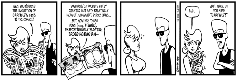
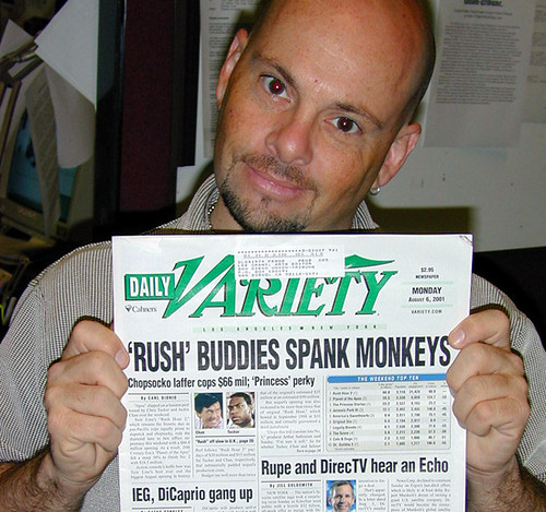
Circa 2001 (IIRC, monkeys were huge that year)


I hope you’ve been enjoying this series of strips (start here) centering on Manuel Dexterity. I’d been planning this tale for many years, patiently waiting until the right time. It’s been my intent all along, having Manuel be gay. In fact, as you look back from his debut in Hodabeast through to the present day, you’ll see that he’s always stayed true to my vision. That’s about 16 years of character development.

Has it really been 16 years? In that time, we’ve known Manuel to be a freelance special-effects artist, a good friend of Puppy’s and Manhattan’s, he’s Hispanic and barely bilingual, he saved Spittle Beach from Comic Sans, he’s had porno dreams about Anthony Bourdain, he was devoured by DeeDee’s temporarily gigantic ass, he paints nudes, he created a TV pilot that NBC swiped and turned into “Heroes” and knows how to do the Wild Boys dance. He’s an important part of Cool Jerk and I refuse to make him “the token gay.”

The last thing I wanted was to screw up Manuel’s day in the spotlight, as it were. Manuel needed a voice that wasn’t mine. So, I enlisted my friend David Poller to help plot and co-write this series. David should be a familiar name to long-time readers— he’s been subtly improving my sense of humor over the years by influencing punchlines (see the Mary Annibal the Cannibal on Gilligan’s Island strips) or just killing me with laugh-out-loud conversations (the peeps strips). He’s even on the back cover of Bimboozled.

David is many things: He’s a professional photographer and photo editor. His appetite for pop culture is insatiable. He’s a snarky socio-political commentator. He’s well-traveled. He’s a Cubs fan. He’s a teacher. He’s lived in — literally — three of the four farthest corners of the continental United States. He’s a mentor. He’s hilarious. He’s brilliant. He’s a good friend. He’s gay. No single one of these traits defines David as a person. And thusly, I —we— didn’t want Manuel to be defined solely by his orientation.

Next week is the double-sized finale, and after that an epilogue strip. By my count, that’s 10 strips in this series (plus the bingo card). David wrote/co-wrote nine of them. Can you guess which one was all mine??


White-out conditions

Accept no substitutes!


Inking Cool Jerk is a two-step process — black ink and white ink. It’s true, people. I make mistakes. Sometimes a line goes wrong, sometimes the brush is flawed, sometimes I need to edit out part of a drawing, sometimes I need to break through a panel border, and sometimes I need to overhaul a drawing from scratch. Also, white ink can be used for effects, especially when you want to add white lines to a black object. That’s when I turn to my correction ink of choice: Pelikan Graphic White.

When I first started using India ink (high school and early college), I made many, many mistakes. It was a learning process. And the first means of correction I had was Liquid Paper. Kids, let me tell you a secret. Liquid Paper is awesome for typewriters, but horrible for cartoonists. It’s a toxic, clumpy mess that junks up your original and makes it almost impossible to re-ink over the correction. My first year of Like, For Shore! strips are all battle-damaged with Liquid Paper corrections, and it’s regrettable. (The strips were regrettable, too… but that’s beside the point.)

Like, For Shore! original circa Oct. 1987. I angled the light source to hilight the Liquid Paper relief map.


Well, I knew the pros at Marvel and DC Comics — as well as syndicated cartoonists — had to use something else. Somewhere I heard about Pelikan Graphic White. I looked for it in Reno and couldn’t find it anywhere, so I ended up buying a jar from Taylor’s art supply store in Sacramento (long-since gone). That was 1988, and I’ve been brand-loyal ever since.

What makes Pelikan Graphic White so good? Well, let me start by saying MY experiences are unique to MY cartooning process, and Pelikan may not work for everyone. In fact, veteran comics inker Klaus Janson says it’s the worst correction ink on the market, and he swears by another brand.

(Click it for detail) Cool Jerk circa 2010. Pelikan keeps the originals nice and tidy!


The first thing you’ll notice is the price. It’s pretty expensive at about $11 a jar. But don’t worry about that, because one jar might be all you’ll ever need. The paint (it’s technically not an ink, but a gouache) is a heavy, goopy paste about as thick as peanut butter. But it’s water-soluble, so I need to do is dole out a pea-sized blob onto a palette and add a couple drops of water to thin it. Soon, you can easily load a watercolor brush with it and start correcting. Its opacity varies with the water content, and when it dries, it matches the texture of the paper. This means I can draw over it with a ink brush or Micron pen and the line won’t wick, spread or bleed. And more importantly, the India ink won’t smear or lift after a subsequent erasing. (That being said, you should erase all your pencil before doing any correcting. It’s just cleaner and safer that way.)

You gotta keep 'em separated!


You’d think that being water-soluble, Pelikan Graphic White would mix with the black ink beneath it, making it a gray mess. Nope… so long as you let the ink dry first. And to keep your gouache pristine white, ALWAYS use a dedicated white-ink brush AND dedicated white-ink water jar. Cross-contamination is dangerous in cooking AND cartooning!

One of the best aspects of Pelikan Graphic White is that a jar will last forever. That pea-sized dollop on your palette will dry out in a few minutes, but all you need is a couple drops of water to reactivate it. For me, that dollop might last 6-8 months before I need to get another small scoop from the jar.

Pelikan Graphic White isn’t without a weakness, however: it has problems covering up laser printer toner (the toner tries to repel the gouache because of its water content, so it sometimes takes 3-4 coats). So if I know I’m going to break a panel with a word balloon, I try to take care of that on the Macintosh.

My well-stocked white bar.


I’ve amassed something of a white-out museum over the years, collecting and trying many varieties of inks and gouaches. Some have many of the same properties as Pelikan, but fail the re-inking or eraser tests.

I just took a look in my Pelikan Graphic White jar and it’s all dried up. No worries— all I need to do is slice out a chunk, put it on the palette, add some water and I’ll be good til 2012.


How a Plan Triple-D became a Plan B

Click it to inflate it!


The above strip above was going to be today’s Cool Jerk, but I had a change of heart. Here’s the backstory:

First, I saw a Garfield comic last year and thought “Holy crap — what the hell happened to his proportions? It doesn’t even look like a CAT anymore!” Over time, Garfield’s eyes had grown so ridiculously huge that I figured at some point they’d sag out of his head like the giant breasts of a 70-year-old stripper.

Then I thought, “Hey, that’s a Cool Jerk.” And I jotted the idea down in my phone. There it sat for months, until last week when I put pencil to paper.

I was pretty happy with it, all the way through the inks. Then it dawned on me, “this is kind of a one-note sight gag, at the expense of Puppy’s… um… physique.” In other words, plain ol’ boob joke. While there’s a time and a place for everything, I grew unhappy with it. I challenged myself to find a better solution that allowed for a sight gag comparing Puppy to that cat’s over-endowed eyeballs without having to recreate the whole strip from scratch.

Thank God I gave Puppy earrings back in 1987.


Multimedia Marvel

Darlene tells me every now and then I should post some non-Cool Jerk art on this here blog. Well, here’s a little gem from 1976.

Apparently I wore clothes like that

As some of you may know — either through my astonishing tales of yesteryear or from first-hand experience — my second grade was unlike any I’ve ever known. Mrs. Joyce Frank turned our Ralya Elementary (Haslett, MI) classroom of 30 desks into a freaking CITY. “Super Citizen City” was its name, actually. And there isn’t enough time in the day to impress upon you how incredible it was. Sure, we learned the three “R”s, phonics and cursive, but we also learned about federal, state and local government and each student had a role (I was a federal judge, IIRC). We also learned about commerce (we each had to create a store to sell our own hand-made goods) and assembly lines (for craft projects and the Yellow Pages-sized yearbook each kid received on the last day). Good grades earned us “money” and we could buy toys and candy with our hard-earned currency. For the major holidays we each made papier-mache decorations (pilgrim and turkey, Santa Claus in a chimney, etc.). And we each made a mobile.

Apparently I liked waffles.

The mobile was a personal reflection of each student. It had to contain a self-portrait, your house, your pet or pets, your favorite food, your favorite TV show, some of your memorable dreams, a list of your positive qualities, a testament to your patriotism (this was during the Bicentennial, after all), your loves and favorite activities. Each art element of the mobile had to be drawn and colored by the student, front-and-back, then reinforced with a sturdy middle layer, then varnished. Mrs. Frank helped out with art touch-ups and lettering where necessary.

My interests that year pretty much revolved around Godzilla movies, Six Million Dollar Man, “Jaws,” my pet iguana Igszy and social networking (except back then, “social networking” was actually “talking in class when I shouldn’t be”). While my art skillz have certainly improved over time, you can see my ability to draw cars pretty much plateaued when I was 7.

In the "I feed gerbils" piece, I tried to draw a green pleather ottoman, wetbar and a Habitrail system on a tile floor. In the heart, I talk about loving my soon-to-be pet iguana. In the "Six Millon (sic) Dollar Man" piece, that's Steve Austin lifting the back of what I can only imagine was a car.

I’ve actually hanged the mobile in every place I’ve lived (when Darlene first saw it a decade ago, she wondered if I secretly had a grade-schooler). It’s gotten a little faded but looks pretty good after nearly 35 years. Thanks to Facebook, I’m in contact with about 25% of my second grade alumni and I bet they all still have their mobiles, somewhere.


Horn draws all over The Rack

I’m sure many of you have seen my recent guest-artist run with comic writer Kevin Church (The Rack — Halloweek). If not… GO THERE FIRST BEFORE YOU READ ANY MORE OF THIS.

This is Kevin’s and my third annual Halloween collaboration, and since I detailed how I create Cool Jerk a few months back, I though I’d share how I did these strips for Kevin. It was a bit of a departure for me, in several ways.

Lookin' Sharp(ie)

First, I’m working with someone. Crazy! Kevin types up his screenplay (for lack of a better layman term), detailing each panel, caption and sound effect. Kevin even went so far as to include hyperlinks to source images, in the event I didn’t know what type of gun or video game I was supposed to draw. So for this Halloweek, there were five screenplays.

Another difference from my Standard Operating Procedure is that I’m working with characters not my own. Now, this happens all the time in comic books, but rarely for me. So I plowed through The Rack Year One (Mostly), Kevin and regular series artist Benjamin Birdie’s first volume of The Rack, and worked up my own variations of his characters. It’s kind of fun to play in someone else’s sandbox every now and then!*

The most-obvious aspect of Halloweek that differs sharply from Cool Jerk is… Sharpies. When I cartoon for myself, I use brush and ink; always have (well, since 1988… and I use Koh-I-Noor rapidographs or Sakura Pigma Micron pens for Doc Splatter). But, a couple years ago, I did the 24 Hour Comics Day challenge all in Sharpies. It allows me to adopt a loose and manic style which works great for Doc Splatter, plus it saves my hand from cramping up (which can happen if I use the brush for too long). Each Halloweek strip is about 98% Sharpie, and 2% Photoshop trickery and retouching.

Finally, The Rack uses a Comicraft font called Monologous. Thing is, Monologous doesn’t have a lowercase, so I have to use Comicraft’s BlahBlahBlah for those instances. (I also snuck in a tiny bit of Hornopolis hee hee. Look for it.)

The actual cartooning process was similar to Cool Jerk. Penciled roughs, printed panels, lightbox, Macintosh post-production, etc.

Click it to huge it up!


Thanks to Kevin for another harrowing week outside my comfort zone, and to Benjamin Birdie for clearing a week from your regular schedule.

*I recently did an illustration for Sarah Kuhn of her characters, featured in her witty and delightful book One Con Glory.


Break it down for me fellas

Just for grins, I decided to scan in a recent strip in its various stages of completion, just to show you what goes into a typical Cool Jerk comic.

Sketchbook sketch

Click it to enlargify it!

Click it to enlargify it!

I wish I used my Cool Jerk sketchbooks more like other artists and cartoonists, filling pages with character studies, still life studies, reference drawings, etc. Instead, I usually cram 2-4 strip roughs per page. I’ve been doing this since the first Like, For Shore! strips in 1987. Ninety-five percent of the time I just jot down basic dialogue and crude shapes to help me envision who is saying what and where (the other five percent gets more fleshed out).

Sharpie scribbles

Click it to enlargify it!

Click it to enlargify it!

At this point I jump to the Mac. In this example, I went to a FreeHand three-panel template with panels 2 and 3 merged into one. I type up the dialogue in Hornopolis and arrange the composition. After printing out the panels with the dialogue, I take it AND a sheet of thick, coated paper and head to the lightbox. There, I use a purple ultra-fine-point Sharpie and scribble out basic composition onto the coated stock, using the panels printout as a guide. (In the image above, I merged the panels and the scribbles, showing you a close representation of what I see on the lightbox) This stage is where I determine if I need to make adjustments to the panels and dialogue. For example, you’ll see little arrows here and there, noting where text or artwork needs to move.

Pencils

Click it to enlargify it!

Click it to enlargify it!

Back to the Mac: I make final compositional and text edits (notice the changes I made to the first panel). Next I print out the FINAL strip on special paper that prevents ink from wicking. I take it and the Sharpie scribbles to the lightbox and reverse the order, this time penciling the artwork onto the latest print while using the Sharpie scribbles as a guide.

Inks

Click it to enlargify it!

Click it to enlargify it!

The most time-consuming stage is the inking, which I do with a 000 Robert Simmons watercolor brush and a special cocktail of Koh-i-noor India inks. India ink is permanent and every line counts. If I’m sloppy or jittery from caffeine, I introduce errors to the artwork. That means I have to spend more time afterward cleaning up the art with Pelikan Graphic White (a special opaque white paste that — once watered down — I apply via brush to correct mistakes or add “white effects”). I also use Sakura Pigma Micron pens for fine line work (like backgrounds) and my signature, which I always save for last.

Post-production

Click it to... oh, you know.

Click it to... oh, you know.

I scan in my original as a 600dpi grayscale TIFF. From there, I rotate the image to an exact 180° axis (sometimes no more than 0.02° rotation — yes, I’m that anal) and crop. I convert the 12.4MB grayscale file to a 1.55MB bitmap file, which knocks the comic into stark black-and-white. This allows for easy Photoshop corrections with the Paintbrush tool and Wacom pressure-sensitive tablet. Sometimes I need to add graphic elements on top of the artwork, like CENSORED or text boxes (see above), so I create those in FreeHand and pull them into Photoshop. Once it’s 100% finalized, I save the “master” file AND make a 72dpi .gif copy for the website. So what you see online is nowhere near as detailed and crisp as the version that makes it into the book.

For more information on the process, go here!


Cool Jerk is proudly powered by WordPress with ComicPress
All content copyright Paul Horn/Cool Jerk Intl. Site design by Hase Design and Paul Horn.