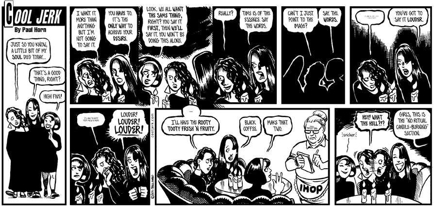
Can’t I just point?Oct 5, 2011

(click it to double-stack it!)
One of the darkest strips I’ve ever drawn.
Comment¬
Cool Jerk is proudly powered by WordPress with ComicPress
All content copyright Paul Horn/Cool Jerk Intl. Site design by Hase Design and Paul Horn.
All content copyright Paul Horn/Cool Jerk Intl. Site design by Hase Design and Paul Horn.


That must be the most bitter looking IHop waitress I have ever seen.
Oh my goth, thank you! LOL.
How heavy was the page and how long did it take for all that ink to dry?
Sorry, but the IHOP reference brought back some bad memories of what occurred at the Carson City IHOP a month ago tomorrow… Yes, pretty dark, I agree. But, you’re forgiven.
I avoid going to Ihop just in case I’m lured into ordering one of their corny-named breakfast platters.
Others have said it better, but wow those IHOP names are cornball.
Dark is right! But I think the strips with Armpit & Puppy in the “Blair Witch” parody were even darker. There are 2-3 strips where every panel is solid black.
@Mr.Hoisington: It might be Bee Yotch, from Denny’s. (search for her in the TAGS).
@zjsimon: Thank YOU!
@KeithG: LOL Yeah, I had to switch to Micron brushes for the large black patches or the paper would’ve curled up.
@R. Horn: I’m glad I’m forgiven for using a lot of ink to make the strip dark!
@April: I wonder which sit-down restaurant chain (in IHOP’s class) has the worst-pun-named dishes. I think Denny’s has a bunch IIRC.
@Bruce: Aw, they’re FUN and FESTIVE! *barf*
@Steverino: You’re absolutely right. I kind of forgot about those until after I posted the strip!
Pretty dark, like the Goth karaoke series. Pretty much any Lynch Bob strip should be this dark. 😉 (off topic, I don’t get how does this strip have anything to do with Carson City??)
I love these double-sized strips. I kinda wish that Cool Jerk would jump to this format, but I’m sure it’s a lot more work.